Today I want to tell you about the story of the Fénix Imóveis website. Currently it is among the best and largest real estate agencies in Chapecó — SC, and has many properties in the catalog for different clients. That is, we have countless personas, with countless problems. To solve this project I used the methodology I like most, which is Bruno Munari's. When I received the initial project briefing, I realized that the problem was much bigger than just making a new website for them. I won't describe the entire process, but the key points that made a big difference in the result.
The main problem
Every website needs an objective, whatever it may be, when you don't have one it becomes ineffective. In this case, the website was beautiful, but finding a property was difficult and the catalog didn't bring almost any relevant information to the user that motivated them to get in touch. That is, no one clicked the "learn more" button.
The first problem found was a very simple question: what is the purpose of the website? As long as there is no answer to this question, there would be no leads. This is the starting point to reach a solution. At the time, I had recently finished a course on inbound marketing and how it could be useful for any company. It brought in its methodology a basic action plan to generate the first leads. This was fundamental to give a path to follow. After the basic definition of what was expected from the website, it was possible to better define the other problems and plan them. Now we have a base to work on.
Problem solving process
Every problem must be divided into parts. To build a lead generation machine from scratch, a lot needed to be done: The first step was to understand who would access the website and what these people were looking for. For this, 4 basic personas were developed.
The first persona was looking for a property to rent, the second for a property to buy, the third wanted to invest, the fourth wanted to advertise their property. Now we have 4 personas and 4 main objectives and we need to develop a solution for each of them. Our personas are basically divided into 3 topics: rent, buy, advertise.
Since we want to feel the pain and the real problem of the personas, we need to put ourselves in their place. We need to act like them when accessing the website. The question I asked myself, if I were to rent a house was: what would I look for first on the website? The answer for me is a form or a shortcut to filter the results. The same applies to the other 2 topics. This may seem a bit obvious, but if we forget to facilitate this small filter, we will have an increase in the website's bounce rate. So are we going to have a form on the website? What would be the fields of this form?
The problem above was the start of the project, the starting point of the flow that the user will go through until reaching the conversion point. I won't list the other problems here, but I'll write soon in another post about each of them. Now, the focus is the starting point on the website.
Initial form
Forms can be a big villain when it comes to generating leads on a website. As we mentioned earlier, the first step would be a form. We needed to design something that was easy and fast. It became clear that some real estate searches used a modal or popup to do this filtering. The big question was how to do this on mobile. Popups or modals can be a big terror and ruin everything, so we must use them very carefully. The answer to this question was in the website's Google Analytics, when analyzing the data searched in the forms, we can notice that a large majority of users presented a standard search according to the URL below.
/tipo_busca=normal&negocio=locacao&tipo=Apartamento&cidade=Chapecó
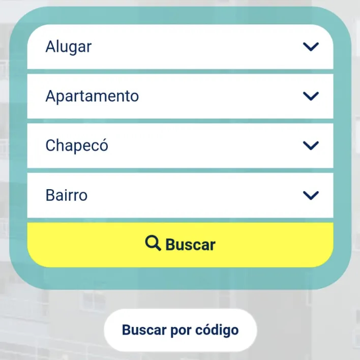
So the data we needed to have mandatory in the initial form were: business, type and city. We also chose to have the "neighborhood" option, as there was a significant number of searches with this field selected. You can see the result of the form below.

Another thing we observed in tests and heat maps is that by leaving the fields filled with the most searched information, users clicked more on "search" and spent less time on the page, going straight to the results.
Search results
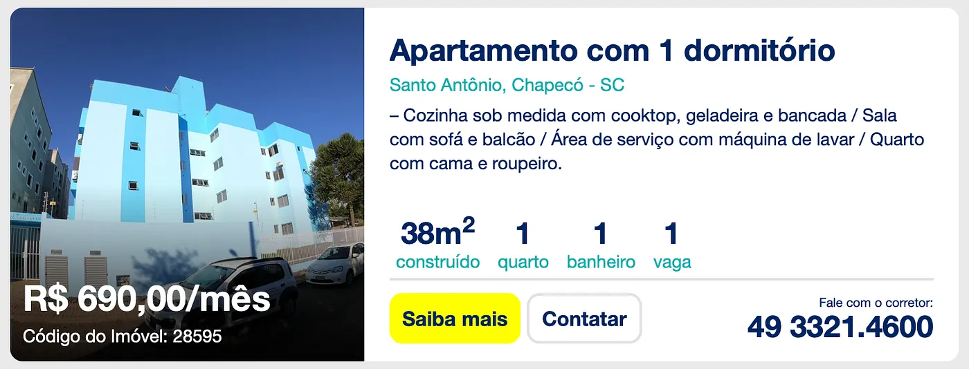
Continuing to think like the user, we just faced the first stage: the search. Now we need to choose a property, in this case the one that catches the most attention. For this we need to convince them to learn more about the property. Each property has its characteristics and some are the key point that will define whether they will open the property or not. The user just made a quick search, in it they didn't define, for example, a price range, nor how many rooms they would like, which makes irrelevant results appear for them. If only the name, value and photo appear, we will force them to do a new search and this is not good, but we can work around this with some more detailed information. After some searches conducted within the website with some samples, the best structure for the card was the image below. This way the user can quickly decide whether to ignore the ad or open it.

The image above shows a general overview of the property and whether it is interesting for you or not. Since we want conversion, we need to add some calls to action. The first is the phone number and the second is contact. This way, without needing to open the property, the user could already somehow register their interest, either by phone or email.
We already have 2 steps of the journey. The first is the form and the second are the search results. With these two steps it's already possible to get a conversion, but if the user is still not convinced, they can open the property page and see the complete list of information.
To conclude
This project is full of details, so many that would render hours and hours of content and this would be very boring. One of the important points is that we managed to solve most of the pain points and transform the website into a lead generation machine. It was all developed to bring the person's contact to the sales team, by phone or email. The focus was to convert.

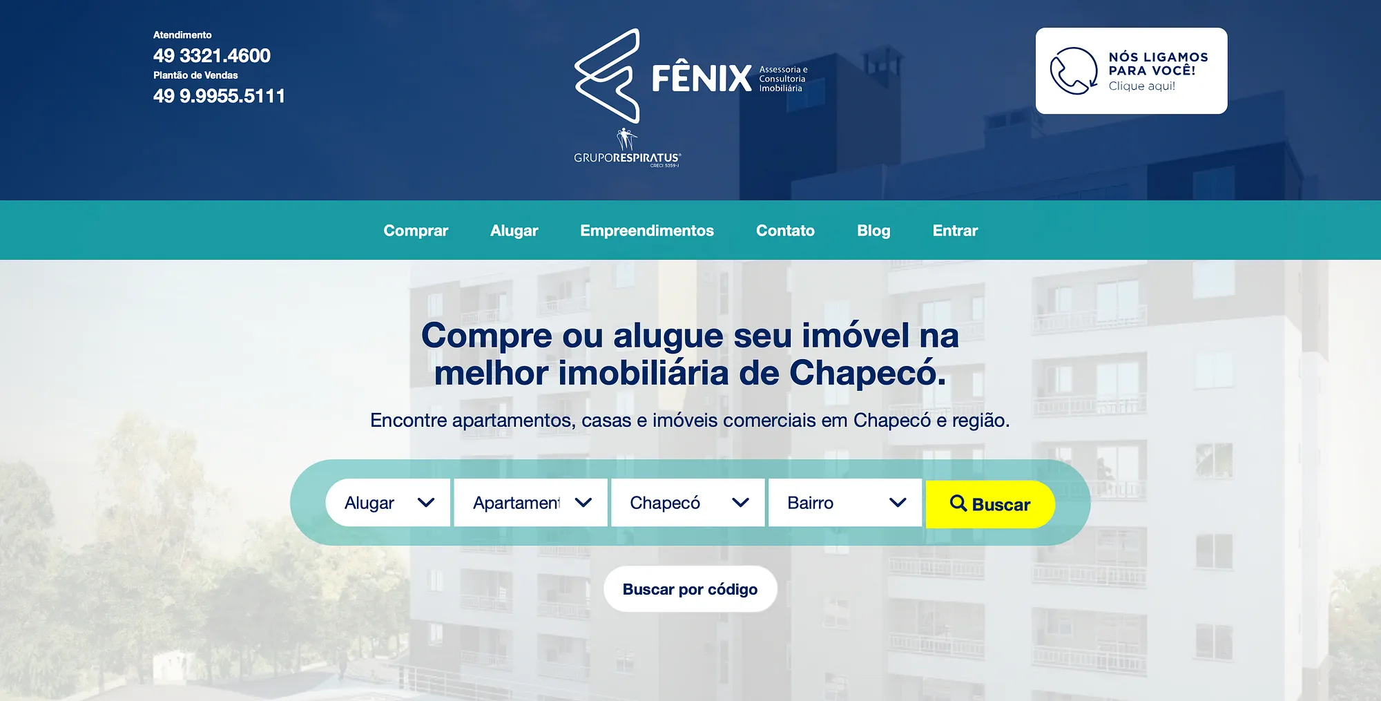
As shown in the desktop version home page, we can observe various shortcuts and conversion points. In the header we notice two options: the first the user calls and the second they leave their data for the support team to get in touch. In the navigation menu they can quickly go to properties for sale, for rent and the form you already know. With this we go to the results page.

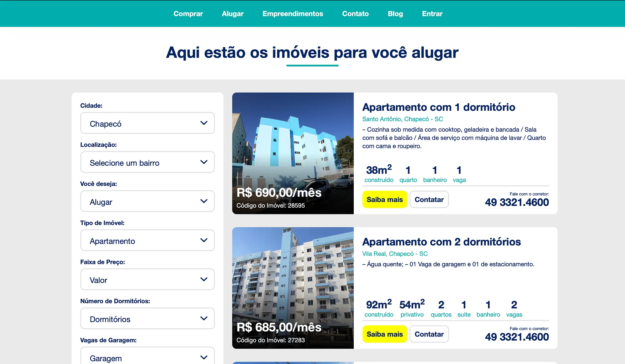
Continuing our guided tour, as soon as the search results appear there is the first feedback. The phrase "here are the properties for you to rent" makes it clear which search and which properties are being presented. Notice that the conversion points for each card are always highlighted as we already discussed.
This project is not limited to just these points mentioned, it has much more, but I believe these were the main ones that really made a difference when the user chose to get in touch.
I hope you liked it and see you next time.
